EMA CROSS v1.0 by ScorpioneroIndicator Description: Multi-Timeframe SMA Table & Plot
This indicator displays a structured table of Simple Moving Averages (SMA) across multiple timeframes and plots them directly on the chart for better trend analysis.
Features:
✅ Multi-Timeframe SMA Calculation: Computes SMAs for different periods (10, 60, and 223) across six timeframes (1m, 3m, 5m, 15m, 30m, 60m).
✅ Sorted SMA Table: Displays a table in the bottom-right corner of the chart, showing the three SMAs per timeframe, sorted in descending order.
✅ Color-Coded Cells: Each SMA is highlighted with a specific color:
🟡 Yellow → 10-period SMA
🔵 Blue → 60-period SMA
🟣 Purple → 223-period SMA
⚪ Gray → Other values
✅ SMA Plotting on the Chart: All calculated SMAs are plotted directly on the price chart, allowing users to visualize their interaction with price movements.
How to Use:
The table provides a quick overview of SMA rankings across timeframes, helping identify bullish or bearish trends.
The SMA plots on the chart can be used for dynamic support/resistance analysis and trend confirmation.
This indicator is ideal for traders who rely on multi-timeframe trend analysis to make informed trading decisions! 🚀
by Scorpionero
חפש סקריפטים עבור " TABLE "
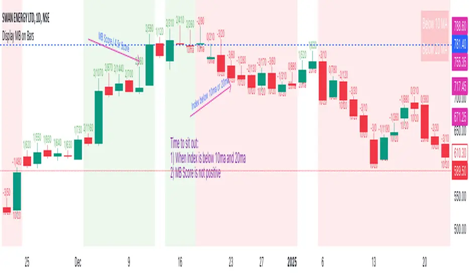
Display MB on BarsDescription
The "Display MB on Bars" Pine Script indicator is designed to visually represent Market Breadth values and R4.5 scores on trading charts. This script enables traders to highlight and analyze key market behavior using pre-defined thresholds for MB scores and dynamically calculated R4.5 values. Additionally, it includes a moving average status table to assess price levels relative to the 10-day and 20-day moving averages.
Features:
1. COB Date Matching: Displays data corresponding to specific "COB dates" provided by the user.
2. MB Value Visualization:
o Highlights bars with a background color based on MB values:
Red if MB ≤ MB_Red (default: -1).
Green if MB ≥ MB_Green (default: 3).
3. R4.5 Scores Display:
o Creates a label on the chart with the MB and R4.5 values when conditions are met (e.g., R4.5 > 200 or specific MB thresholds).
4. Index Moving Average Comparison:
o Calculates 10-day and 20-day moving averages for the selected symbol (default: NSE:NIFTYMIDSML400).
o Shows the price position relative to these moving averages in a table.
How to Use:
1. Configure Inputs:
o COB Dates: Enter a comma-separated list of dates in the format DD-MM-YYYY.
o MB Values: Provide the corresponding MB scores for the COB dates.
o R4.5 Values: Provide the R4.5 scores for the COB dates.
o Set the thresholds for MB values (MB Red<= and MB Green>=).
o Toggle features like MB, RS (R4.5), and the moving average status table.
2. Interpret the Output:
o Observe background colors on the bars:
Red: Indicates MB is less than or equal to the lower threshold.
Green: Indicates MB exceeds the upper threshold.
o Check labels above bars for R4.5 and MB values when conditions are met.
o Refer to the status table on the top-right corner to understand price positions relative to 10-day and 20-day moving averages.
This script is especially useful for traders seeking insights into custom metrics like MB and R4.5, enabling quick identification of key patterns and trends in the market.
MTF Fractal Bias Confluence DetectorMTF Fractal Bias Confluence Detector
This indicator, the MTF Fractal Bias Confluence Detector, is based on the idea that the market exhibits fractal behaviour. The origin of the idea traces back to 1963, when Benoit Mandelbrot analyzed the fluctuations in cotton prices over a time series starting in 1900, discovering that price changes exhibited scale-invariant patterns. This means that the curve representing daily price changes mirrored the shape of monthly price changes, highlighting the fractal nature of market behaviour. When applied to swing points across multiple timeframes (MTF), this concept suggests that swing points demonstrate similar patterns regardless of the timeframe being analyzed. These self-similar fractal structures provide traders with insights into market reversals and trends, making them a powerful tool for multi-timeframe analysis.
A Swing Point is made up of three main parts: a move away from the last Break level; forming a peak (pivot point) with a Fakeout of the peak (explained through an example later); and a subsequent move away from it. These swing points recur across all timeframes as part of cyclical momentum patterns, meaning each swing point gives rise to a new cycle of market movement. Due to the fractal nature of the market, larger cycles encompass multiple smaller ones.
The theory behind the Fractal Bias Confluence Detector utilizes the idea that the market movements are fractal in nature and illustrates how such swing points can be identified across MTFs. To do so, we examine the Peak Fakeouts within these cycles, as they form. It is not possible to know in advance how long each of these moves will last, but a Swing Point will often occur with a Peak Fakeout. Therefore, the most critical element is to identify the Peak Fakeout.
The snapshot below captures a Peak Fakeout, as discussed earlier.
Similarly, the following snapshot shows various possible breakdowns of Higher Time Frame (HTF) cycles into smaller Lower Time Frame (LTF) movements. The chart contains a white table(not part of the indicator and shown for illustration purposes only).
To further illustrate. Consider the combination of Time Frames (TF) from the 2nd row (from the above snapshot). Cycle TF (1M), Setup TF (1W), Momentum TF (1D) etc.
Price movements in the 1M TF highlight the direction in which HTF traders are pushing the market. Often, when markets have broken out of a level, they tend to form a peak and can then pull back towards the prior breakout level. Once the pullback is beyond the last breakout level, in the opposite direction, we may say the peak formation is created, and directional bias has changed. This is also called Peak Fakeout. Due to the fractal nature of the market, Swing Points on the HTF will often constitute multiple Swing Points on the LTF, though they are not always in sync. However, after such peak formation, there is a high probability that the price might move away from the peak for at least 1 candle (in the cycle TF). This theory illustrates that once a new cycle is in play, we can then look at 1W (Setup TF) to look for possible in-sync movements, at least within that 1 candle of the HTF. Repeating the same for further lower TFs, we may arrive at a confluence of Fractal Bias and see how the movements in LTF are driven by the HTF momentum.
Another example within the chart:
Note: The above examples are just for illustration purposes, and other permutations and combinations of movements across multiple TFs are also possible.
This indicator aims to help users identify such fractal-bias-confluences, so that they can leverage the fractal nature of the market to get a holistic view. To do so, the indicator displays how the market has moved across multiple time frames, with respect to different historical levels.
Features:
1. The bias summary table
The following snapshot depicts the bias summary table at the bottom right of the chart.
1.1. Workings: The table will display, for various TFs, in the first four (starting from "current" to Prev ) rows, one of the following.
"F/H" , " Acronym for the failed break of the previous high",
"F/L" , " Acronym for the failed break of the previous low",
"B/H" , " Acronym for the break of the previous high",
"B/L" , " Acronym for the break of the previous low",
"IN" , " Acronym for an inside candle (never broke high or low of perv candle)",
"OT" , " Acronym for an outside candle (broke both high and low of previous candle and closing price is in between previous high and low)".
Note: these acronyms are customizable according to the user's choice of terminology in any language, as shown in the snapshot below.
1.1.1 In the above snapshot, the 1st row, called "Current", shows how the current candle is evolving with respect to the previous one. The "previous" row shows how the previous candle closed with respect to the pre-previous one. The next two rows represent the bias of the pre-previous and pre-pre-previous in a similar manner. By default, the bias is updated in real-time, even for the already closed historical candles. For example, if the previous 4H candle closed as a B/H and the current price then comes below the pre-previous 4H candle high, then the bias of the previous candle will get updated to F/H. This informs the user that the break above the pre-previous high has failed. However, the user has the option to turn this off. The information in these four rows shows the user how the market is moving currently and how it evolved before reaching the current price levels.
Note: The calculation done by the indicator is to keep track of how the price is moving with respect to the last candle levels in real-time. This means if the price first goes above the previous high and then goes below the previous low, the indicator is equipped to display what happened in the most recent time. The snapshot below shows the option to turn on/off such updates in the bias summary table.
Note: While the bias summary table is turned on, the user also has the option to turn off Prev and Prev rows, as shown in the snapshot below.
1.1.2 The 2nd to last row, called CL/CS(Consecutive Long/Short), shows whether consecutive (2+) breaks of high/low happened or not in one direction without taking out the previous candle's range in the opposite direction. When conditions are met, it will show the number of times the price has been pushed in one direction (in the above manner), followed by "L" for long and "S" for short, for each TF, for example, "4L". It gets updated in real-time for each push in the same direction. Furthermore, a good analogy of "4L" on an HTF is 4 consecutive Break of Structure (BOS) (in the same direction) on LTF, without a Change of Character (CHoCH). Another example would be Stacey Burke's 3 consecutive rises that can be mapped in the indicator, if the conditions are met for "3L" for a given TF.
1.1.3 The last row, FRC/FGC, stands for the first red/green candle. It shows whether the last candle of a TF has closed as green (i.e., close>open) after posting two red candles (i.e., close

Smart Money Breakouts [iskess 01-02 11:05]This is an big update to the excellent Smart Money Breakout Script published in Oct 2023 by ChartPrime who, to my knowledge, was the original author.
FULL CREDIT GOES TO CHARTPRIME FOR THIS ORIGINAL WORK.
Per the moderator's rules, you will find below a meaningful, detailed self-contained description that does not rely on delegation to the open source code or links to other content. You will find in the description details on what the script does, how it does that, how to use it, and how it is original.
The "Smart Money Breakouts" indicator is designed to identify breakouts based on changes in character (CHOCH) or breaks of structure (BOS) patterns, facilitating automated trading with user-defined Take Profit (TP) level.
The indicator incorporates essential elements such as volume analysis and a data table to assist traders in optimizing their strategies.
🔸Breakout Detection:
The indicator scans price movements for "Change in Character" (CHOCH) and "Break of Structure" (BOS) patterns, signaling potential breakout opportunities in the market.
🔸User-Defined TP/SL :
Traders can customize the Take Profit (TP) and Stop Loss (SL) through the indicator settings, with these levels dynamically calculated based on the Average True Range (ATR). This allows for precise risk management and profit targets that adapt to market volatility. Traders can also select the lookback period for the TP/SL calculations.
🔸Volume Analysis and Trade Direction Specific Analysis:
The indicator includes a volume checker that provides valuable insights into the strength of the breakout, taking into account trade direction.
🔸If the volume label is red and the trade is long, it suggests a higher likelihood of hitting the Stop Loss (SL).
🔸If the volume label is green and the trade is long, it indicates a higher probability of hitting the Take Profit (TP).
🔸For short trades, a red volume label suggests a higher likelihood of hitting TP, while a green label suggests a higher likelihood of hitting SL.
🔸A yellow volume label suggests that the volume is inconclusive, neither favoring bullish nor bearish movements.
🔸Data Table:
The indicator features a data table that keeps track of the number of winning and losing trades for specific timeframes or configurations. It also shows the percentage of profits vs losses, and the overall profit/loss for the selected lookback period.
This table serves as a valuable tool for traders to analyze performance and discover optimal settings and timeframes.
The "Smart Money Breakouts" indicator provides traders with a comprehensive solution for breakout trading, combining technical analysis of changes in character and breaks of structure, volume insights, and performance tracking while dynamically adjusting TP and SL levels based on market volatility through the ATR.
This version of the script is a "significant improvement" from Chart Prime's original work in the following ways:
- A selectable range of candles for the profit/loss calculations to look back on.
- An updated table that includes the percentage of wins/losses, and and overall P&L during the selected lookback range.
- The user can now select only Long trades, Short trades, or both.
- The percentage gain/loss is now indicated for every trade on the chart.
- The user can now select a different multiplier for Stop Loss or Take Profit thresholds.

Multi Indicator SummaryPurpose: It calculates and displays bullish and bearish order blocks, key levels derived from recent price movements, which traders use to identify potential support and resistance areas.
Inputs: Users can customize the order block length, defining the range of price data used for calculations.
Logic: The script uses ta.lowest and ta.highest functions to compute order blocks based on specified periods for bullish and bearish trends.
Additional Levels: It identifies extra order blocks (bullish_below and bearish_above) to provide more context for deeper support or higher resistance.
Price Table: A visual table is created on the chart, showing the current price, bullish and bearish order blocks, and additional bearish levels above the current price.
Alerts: Alerts are triggered when the price crosses key order block levels, helping traders react to significant price movements.
Flexibility: The table dynamically updates based on the chart’s ticker and timeframe, ensuring it always reflects the latest data.
Bearish Above Price: Highlights the most recent bearish order block above the current price to inform traders about potential resistance areas.
Visualization: The clear table format aids quick decision-making by summarizing key levels in an accessible way.
Usability: This script is especially useful for intraday and swing traders seeking to integrate order block analysis into their strategies.

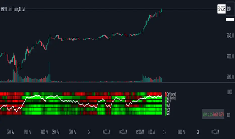
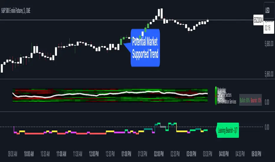
Index Trend MapThe Index Trend Map is a versatile and powerful tool designed to provide a sentiment heatmap for major market indices. This indicator tracks the average trend direction across multiple indices data points, including a default setting for S&P 500 Futures ( NYSE:ES ), Nasdaq 100 Futures ( SEED_ALEXDRAYM_SHORTINTEREST2:NQ ), Dow Jones Futures ( SEED_CRYPTOSLATE_VANTAGEPOINT:YM ), Russell 2000 Futures ( CAPITALCOM:RTY ) and traditionally inverse data points like the VIX– allowing traders to quickly assess overall market sentiment and make more informed trading decisions.
Key Features:
Sentiment Heatmap: Displays a color-coded heatmap for indices, with green indicating bullish sentiment and red indicating bearish sentiment. Each index’s sentiment is calculated on a scale from 0 to 100, with 50 as the neutral point.
Bullish/Bearish Percentages: Real-time calculations of the percentage of indices in bullish or bearish territory are displayed in a dynamic table for easy reference.
Tracks Major Indices: Monitors popular indices or their related futures contracts with the option to include custom tickers.
Inverse Sentiment Options: Allows users to invert sentiment calculations for specific symbols (e.g., VIX or DXY) to reflect their inverse relationship to broader market trends.
Customizable Moving Averages: Choose from SMA, EMA, WMA, or DEMA to tailor the trend calculation to your trading strategy.
Overlay Sentiment Colors on Candles: Option to display sentiment as green (bullish) or red (bearish) directly on price chart candles, enhancing market trend visibility.
Heatmap Visualization:
The heatmap assigns each index a sentiment score based on its calculated average.
Sentiment values above the 50 midline indicate bullish sentiment, while those below 50 indicate bearish sentiment.
Dynamic Table:
Located in the bottom right corner, this table displays real-time percentages of indices that are bullish and bearish. Example: If 4 out of 6 index data points are bullish, the table will show 66.6% bullish and 33.3% bearish.
Best Used For:
Intraday Traders: Assess real-time index sentiment during active market hours to make data-driven trading decisions.
Swing Traders: Monitor index trends over time to identify shifts in market sentiment and positioning opportunities.
Market Breadth Analysis: Identify broader market strength or weakness by analyzing multiple indices simultaneously.
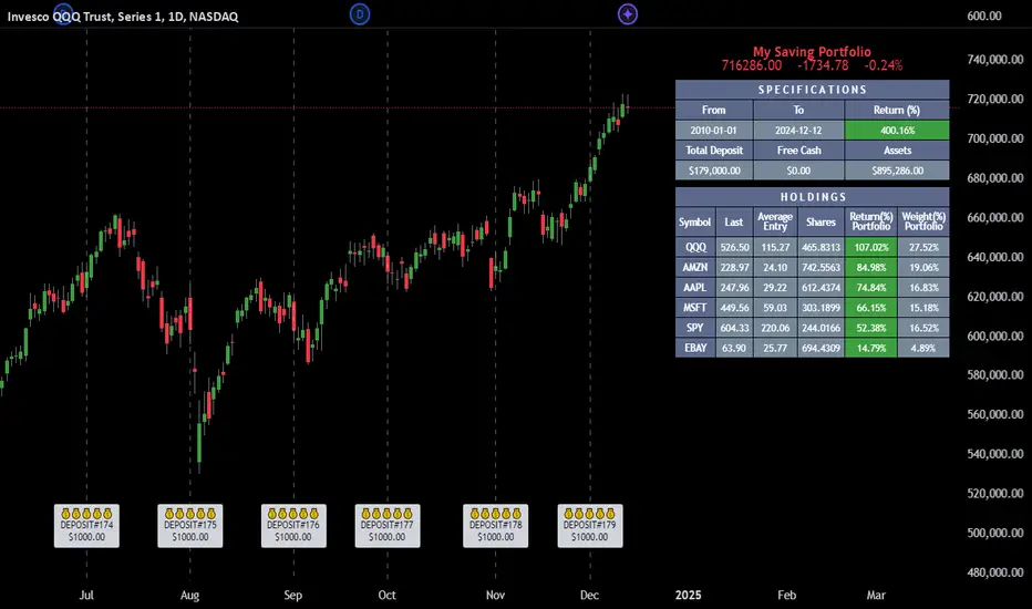
Employee Portfolio Generator [By MUQWISHI]▋ INTRODUCTION :
The “Employee Portfolio Generator” simplifies the process of building a long-term investment portfolio tailored for employees seeking to build wealth through investments rather than traditional bank savings. The tool empowers employees to set up recurring deposits at customizable intervals, enabling to make additional purchases in a list of preferred holdings, with the ability to define the purchasing investment weight for each security. The tool serves as a comprehensive solution for tracking portfolio performance, conducting research, and analyzing specific aspects of portfolio investments. The output includes an index value, a table of holdings, and chart plots, providing a deeper understanding of the portfolio's historical movements.
_______________________
▋ OVERVIEW:
● Scenario (The chart above can be taken as an example) :
Let say, in 2010, a newly employed individual committed to saving $1,000 each month. Rather than relying on a traditional savings account, chose to invest the majority of monthly savings in stable well-established stocks. Allocating 30% of monthly saving to AMEX:SPY and another 30% to NASDAQ:QQQ , recognizing these as reliable options for steady growth. Additionally, there was an admired toward innovative business models of NASDAQ:AAPL , NASDAQ:MSFT , NASDAQ:AMZN , and NASDAQ:EBAY , leading to invest 10% in each of those companies. By the end of 2024, after 15 years, the total monthly deposits amounted to $179,000, which would have been the result of traditional saving alone. However, by sticking into long term invest, the value of the portfolio assets grew, reaching nearly $900,000.
_______________________
▋ OUTPUTS:
The table can be displayed in three formats:
1. Portfolio Index Title: displays the index name at the top, and at the bottom, it shows the index value, along with the chart timeframe, e.g., daily change in points and percentage.
2. Specifications: displays the essential information on portfolio performance, including the investment date range, total deposits, free cash, returns, and assets.
3. Holdings: a list of the holding securities inside a table that contains the ticker, last price, entry price, return percentage of the portfolio's total deposits, and latest weighted percentage of the portfolio. Additionally, a tooltip appears when the user passes the cursor over a ticker's cell, showing brief information about the company, such as the company's name, exchange market, country, sector, and industry.
4. Indication of New Deposit: An indication of a new deposit added to the portfolio for additional purchasing.
5. Chart: The portfolio's historical movements can be visualized in a plot, displayed as a bar chart, candlestick chart, or line chart, depending on the preferred format, as shown below.
_______________________
▋ INDICATOR SETTINGS:
Section(1): Table Settings
(1) Naming the index.
(2) Table location on the chart and cell size.
(3) Sorting Holdings Table. By securities’ {Return(%) Portfolio, Weight(%) Portfolio, or Ticker Alphabetical} order.
(4) Choose the type of index: {Assets, Return, or Return (%)}, and the plot type for the portfolio index: {Candle, Bar, or Line}.
(5) Positive/Negative colors.
(6) Table Colors (Title, Cell, and Text).
(7) To show/hide any of selected indicator’s components.
Section(2): Recurring Deposit Settings
(1) From DateTime of starting the investment.
(2) To DateTime of ending the investment
(3) The amount of recurring deposit into portfolio and currency.
(4) The frequency of recurring deposits into the portfolio {Weekly, 2-Weeks, Monthly, Quarterly, Yearly}
(5) The Depositing Model:
● Fixed: The amount for recurring deposits remains constant throughout the entire investment period.
● Increased %: The recurring deposit amount increases at the selected frequency and percentage throughout the entire investment period.
(5B) If the user selects “ Depositing Model: Increased % ”, specify the growth model (linear or exponential) and define the rate of increase.
Section(3): Portfolio Holdings
(1) Enable a ticker in the investment portfolio.
(2) The selected deposit frequency weight for a ticker. For example, if the monthly deposit is $1,000 and the selected weight for XYZ stock is 30%, $300 will be used to purchase shares of XYZ stock.
(3) Select up to 6 tickers that the investor is interested in for long-term investment.
Please let me know if you have any questions
Quantify [Entry Model] | FractalystWhat’s the indicator’s purpose and functionality?
Quantify is a machine learning entry model designed to help traders identify high-probability setups to refine their strategies.
➙ Simply pick your bias, select your entry timeframes, and let Quantify handle the rest for you.
Can the indicator be applied to any market approach/trading strategy?
Absolutely, all trading strategies share one fundamental element: Directional Bias
Once you’ve determined the market bias using your own personal approach, whether it’s through technical analysis or fundamental analysis, select the trend direction in the Quantify user inputs.
The algorithm will then adjust its calculations to provide optimal entry levels aligned with your chosen bias. This involves analyzing historical patterns to identify setups with the highest potential expected values, ensuring your setups are aligned with the selected direction.
Can the indicator be used for different timeframes or trading styles?
Yes, regardless of the timeframe you’d like to take your entries, the indicator adapts to your trading style.
Whether you’re a swing trader, scalper, or even a position trader, the algorithm dynamically evaluates market conditions across your chosen timeframe.
How can this indicator help me to refine my trading strategy?
1. Focus on Positive Expected Value
• The indicator evaluates every setup to ensure it has a positive expected value, helping you focus only on trades that statistically favor long-term profitability.
2. Adapt to Market Conditions
• By analyzing real-time market behavior and historical patterns, the algorithm adjusts its calculations to match current conditions, keeping your strategy relevant and adaptable.
3. Eliminate Emotional Bias
• With clear probabilities, expected values, and data-driven insights, the indicator removes guesswork and helps you avoid emotional decisions that can damage your edge.
4. Optimize Entry Levels
• The indicator identifies optimal entry levels based on your selected bias and timeframes, improving robustness in your trades.
5. Enhance Risk Management
• Using tools like the Kelly Criterion, the indicator suggests optimal position sizes and risk levels, ensuring that your strategy maintains consistency and discipline.
6. Avoid Overtrading
• By highlighting only high-potential setups, the indicator keeps you focused on quality over quantity, helping you refine your strategy and avoid unnecessary losses.
How can I get started to use the indicator for my entries?
1. Set Your Market Bias
• Determine whether the market trend is Bullish or Bearish using your own approach.
• Select the corresponding bias in the indicator’s user inputs to align it with your analysis.
2. Choose Your Entry Timeframes
• Specify the timeframes you want to focus on for trade entries.
• The indicator will dynamically analyze these timeframes to provide optimal setups.
3. Let the Algorithm Analyze
• Quantify evaluates historical data and real-time price action to calculate probabilities and expected values.
• It highlights setups with the highest potential based on your selected bias and timeframes.
4. Refine Your Entries
• Use the insights provided—entry levels, probabilities, and risk calculations—to align your trades with a math-driven edge.
• Avoid overtrading by focusing only on setups with positive expected value.
5. Adapt to Market Conditions
• The indicator continuously adapts to real-time market behavior, ensuring its recommendations stay relevant and precise as conditions change.
How does the indicator calculate the current range?
The indicator calculates the current range by analyzing swing points from the very first bar on your charts to the latest available bar it identifies external liquidity levels, also known as BSLQ (buy-side liquidity levels) and SSLQ (sell-side liquidity levels).
What's the purpose of these levels? What are the underlying calculations?
1. Understanding Swing highs and Swing Lows
Swing High: A Swing High is formed when there is a high with 2 lower highs to the left and right.
Swing Low: A Swing Low is formed when there is a low with 2 higher lows to the left and right.
2. Understanding the purpose and the underlying calculations behind Buyside, Sellside and Pivot levels.
3. Identifying Discount and Premium Zones.
4. Importance of Risk-Reward in Premium and Discount Ranges
How does the script calculate probabilities?
The script calculates the probability of each liquidity level individually. Here's the breakdown:
1. Upon the formation of a new range, the script waits for the price to reach and tap into pivot level level. Status: "■" - Inactive
2. Once pivot level is tapped into, the pivot status becomes activated and it waits for either liquidity side to be hit. Status: "▶" - Active
3. If the buyside liquidity is hit, the script adds to the count of successful buyside liquidity occurrences. Similarly, if the sellside is tapped, it records successful sellside liquidity occurrences.
4. Finally, the number of successful occurrences for each side is divided by the overall count individually to calculate the range probabilities.
Note: The calculations are performed independently for each directional range. A range is considered bearish if the previous breakout was through a sellside liquidity. Conversely, a range is considered bullish if the most recent breakout was through a buyside liquidity.
What does the multi-timeframe functionality offer?
You can incorporate up to 4 higher timeframe probabilities directly into the table.
This feature allows you to analyze the probabilities of buyside and sellside liquidity across multiple timeframes, without the need to manually switch between them.
By viewing these higher timeframe probabilities in one place, traders can spot larger market trends and refine their entries and exits with a better understanding of the overall market context.
What are the multi-timeframe underlying calculations?
The script uses the same calculations (mentioned above) and uses security function to request the data such as price levels, bar time, probabilities and booleans from the user-input timeframe.
How does the Indicator Identifies Positive Expected Values?
Quantify instantly calculates whether a trade setup has the potential to generate positive expected value (EV).
To determine a positive EV setup, the indicator uses the formula:
EV = ( P(Win) × R(Win) ) − ( P(Loss) × R(Loss))
where:
- P(Win) is the probability of a winning trade.
- R(Win) is the reward or return for a winning trade, determined by the current risk-to-reward ratio (RR).
- P(Loss) is the probability of a losing trade.
- R(Loss) is the loss incurred per losing trade, typically assumed to be -1.
By calculating these values based on historical data and the current trading setup, the indicator helps you understand whether your trade has a positive expected value.
How can I know that the setup I'm going to trade with has a positive EV?
If the indicator detects that the adjusted pivot and buy/sell side probabilities have generated positive expected value (EV) in historical data, the risk-to-reward (RR) label within the range box will be colored blue and red .
If the setup does not produce positive EV, the RR label will appear gray.
This indicates that even the risk-to-reward ratio is greater than 1:1, the setup is not likely to yield a positive EV because, according to historical data, the number of losses outweighs the number of wins relative to the RR gain per winning trade.
What is the confidence level in the indicator, and how is it determined?
The confidence level in the indicator reflects the reliability of the probabilities calculated based on historical data. It is determined by the sample size of the probabilities used in the calculations. A larger sample size generally increases the confidence level, indicating that the probabilities are more reliable and consistent with past performance.
How does the confidence level affect the risk-to-reward (RR) label?
The confidence level (★) is visually represented alongside the probability label. A higher confidence level indicates that the probabilities used to determine the RR label are based on a larger and more reliable sample size.
How can traders use the confidence level to make better trading decisions?
Traders can use the confidence level to gauge the reliability of the probabilities and expected value (EV) calculations provided by the indicator. A confidence level above 95% is considered statistically significant and indicates that the historical data supporting the probabilities is robust. This high confidence level suggests that the probabilities are reliable and that the indicator’s recommendations are more likely to be accurate.
In data science and statistics, a confidence level above 95% generally means that there is less than a 5% chance that the observed results are due to random variation. This threshold is widely accepted in research and industry as a marker of statistical significance. Studies such as those published in the Journal of Statistical Software and the American Statistical Association support this threshold, emphasizing that a confidence level above 95% provides a strong assurance of data reliability and validity.
Conversely, a confidence level below 95% indicates that the sample size may be insufficient and that the data might be less reliable. In such cases, traders should approach the indicator’s recommendations with caution and consider additional factors or further analysis before making trading decisions.
How does the sample size affect the confidence level, and how does it relate to my TradingView plan?
The sample size for calculating the confidence level is directly influenced by the amount of historical data available on your charts. A larger sample size typically leads to more reliable probabilities and higher confidence levels.
Here’s how the TradingView plans affect your data access:
Essential Plan
The Essential Plan provides basic data access with a limited amount of historical data. This can lead to smaller sample sizes and lower confidence levels, which may weaken the robustness of your probability calculations. Suitable for casual traders who do not require extensive historical analysis.
Plus Plan
The Plus Plan offers more historical data than the Essential Plan, allowing for larger sample sizes and more accurate confidence levels. This enhancement improves the reliability of indicator calculations. This plan is ideal for more active traders looking to refine their strategies with better data.
Premium Plan
The Premium Plan grants access to extensive historical data, enabling the largest sample sizes and the highest confidence levels. This plan provides the most reliable data for accurate calculations, with up to 20,000 historical bars available for analysis. It is designed for serious traders who need comprehensive data for in-depth market analysis.
PRO+ Plans
The PRO+ Plans offer the most extensive historical data, allowing for the largest sample sizes and the highest confidence levels. These plans are tailored for professional traders who require advanced features and significant historical data to support their trading strategies effectively.
For many traders, the Premium Plan offers a good balance of affordability and sufficient sample size for accurate confidence levels.
What is the HTF probability table and how does it work?
The HTF (Higher Time Frame) probability table is a feature that allows you to view buy and sellside probabilities and their status from timeframes higher than your current chart timeframe.
Here’s how it works:
Data Request: The table requests and retrieves data from user-defined higher timeframes (HTFs) that you select.
Probability Display: It displays the buy and sellside probabilities for each of these HTFs, providing insights into the likelihood of price movements based on higher timeframe data.
Detailed Tooltips: The table includes detailed tooltips for each timeframe, offering additional context and explanations to help you understand the data better.
What do the different colors in the HTF probability table indicate?
The colors in the HTF probability table provide visual cues about the expected value (EV) of trading setups based on higher timeframe probabilities:
Blue: Suggests that entering a long position from the HTF user-defined pivot point, targeting buyside liquidity, is likely to result in a positive expected value (EV) based on historical data and sample size.
Red: Indicates that entering a short position from the HTF user-defined pivot point, targeting sellside liquidity, is likely to result in a positive expected value (EV) based on historical data and sample size.
Gray: Shows that neither long nor short trades from the HTF user-defined pivot point are expected to generate positive EV, suggesting that trading these setups may not be favorable.
What machine learning techniques are used in Quantify?
Quantify offers two main machine learning approaches:
1. Adaptive Learning (Fixed Sample Size): The algorithm learns from the entire dataset without resampling, maintaining a stable model that adapts to the latest market conditions.
2. Bootstrap Resampling: This method creates multiple subsets of the historical data, allowing the model to train on varying sample sizes. This technique enhances the robustness of predictions by ensuring that the model is not overfitting to a single dataset.
How does machine learning affect the expected value calculations in Quantify?
Machine learning plays a key role in improving the accuracy of expected value (EV) calculations. By analyzing historical price action, liquidity hits, and market bias patterns, the model continuously adjusts its understanding of risk and reward, allowing the expected value to reflect the most likely market movements. This results in more precise EV predictions, helping traders focus on setups that maximize profitability.
What is the Kelly Criterion, and how does it work in Quantify?
The Kelly Criterion is a mathematical formula used to determine the optimal position size for each trade, maximizing long-term growth while minimizing the risk of large drawdowns. It calculates the percentage of your portfolio to risk on a trade based on the probability of winning and the expected payoff.
Quantify integrates this with user-defined inputs to dynamically calculate the most effective position size in percentage, aligning with the trader’s risk tolerance and desired exposure.
How does Quantify use the Kelly Criterion in practice?
Quantify uses the Kelly Criterion to optimize position sizing based on the following factors:
1. Confidence Level: The model assesses the confidence level in the trade setup based on historical data and sample size. A higher confidence level increases the suggested position size because the trade has a higher probability of success.
2. Max Allowed Drawdown (User-Defined): Traders can set their preferred maximum allowed drawdown, which dictates how much loss is acceptable before reducing position size or stopping trading. Quantify uses this input to ensure that risk exposure aligns with the trader’s risk tolerance.
3. Probabilities: Quantify calculates the probabilities of success for each trade setup. The higher the probability of a successful trade (based on historical price action and liquidity levels), the larger the position size suggested by the Kelly Criterion.
What is a trailing stoploss, and how does it work in Quantify?
A trailing stoploss is a dynamic risk management tool that moves with the price as the market trend continues in the trader’s favor. Unlike a fixed take profit, which stays at a set level, the trailing stoploss automatically adjusts itself as the market moves, locking in profits as the price advances.
In Quantify, the trailing stoploss is enhanced by incorporating market structure liquidity levels (explain above). This ensures that the stoploss adjusts intelligently based on key price levels, allowing the trader to stay in the trade as long as the trend remains intact, while also protecting profits if the market reverses.
Why would a trader prefer a trailing stoploss based on liquidity levels instead of a fixed take-profit level?
Traders who use trailing stoplosses based on liquidity levels prefer this method because:
1. Market-Driven Flexibility: The stoploss follows the market structure rather than being static at a pre-defined level. This means the stoploss is less likely to be hit by small market fluctuations or false reversals. The stoploss remains adaptive, moving as the market moves.
2. Riding the Trend: Traders can capture more profit during a sustained trend because the trailing stop will adjust only when the trend starts to reverse significantly, based on key liquidity levels. This allows them to hold positions longer without prematurely locking in profits.
3. Avoiding Premature Exits: Fixed stoploss levels may exit a trade too early in volatile markets, while liquidity-based trailing stoploss levels respect the natural flow of price action, preventing the trader from exiting too soon during pullbacks or minor retracements.
🎲 Becoming the House: Gaining an Edge Over the Market
In American roulette, the casino has a 5.26% edge due to the presence of the 0 and 00 pockets. On even-money bets, players face a 47.37% chance of winning, while true 50/50 odds would require a 50% chance. This edge—the gap between the payout odds and the true probabilities—ensures that, statistically, the casino will always win over time, even if individual players win occasionally.
From a Trader’s Perspective
In trading, your edge comes from identifying and executing setups with a positive expected value (EV). For example:
• If you identify a setup with a 55.48% chance of winning and a 1:1 risk-to-reward (RR) ratio, your trade has a statistical advantage over a neutral (50/50) probability.
This edge works in your favor when applied consistently across a series of trades, just as the casino’s edge ensures profitability across thousands of spins.
🎰 Applying the Concept to Trading
Like casinos leverage their mathematical edge in games of chance, you can achieve long-term success in trading by focusing on setups with positive EV and managing your trades systematically. Here’s how:
1. Probability Advantage: Prioritize trades where the probability of success (win rate) exceeds the breakeven rate for your chosen risk-to-reward ratio.
• Example: With a 1:1 RR, you need a win rate above 50% to achieve positive EV.
2. Risk-to-Reward Ratio (RR): Even with a win rate below 50%, you can gain an edge by increasing your RR (e.g., a 40% win rate with a 2:1 RR still has positive EV).
3. Consistency and Discipline: Just as casinos profit by sticking to their mathematical advantage over thousands of spins, traders must rely on their edge across many trades, avoiding emotional decisions or overleveraging.
By targeting favorable probabilities and managing trades effectively, you “become the house” in your trading. This approach allows you to leverage statistical advantages to enhance your overall performance and achieve sustainable profitability.
What Makes the Quantify Indicator Original?
1. Data-Driven Edge
Unlike traditional indicators that rely on static formulas, Quantify leverages probability-based analysis and machine learning. It calculates expected value (EV) and confidence levels to help traders identify setups with a true statistical edge.
2. Integration of Market Structure
Quantify uses market structure liquidity levels to dynamically adapt. It identifies key zones like swing highs/lows and liquidity traps, enabling users to align entries and exits with where the market is most likely to react. This bridges the gap between price action analysis and quantitative trading.
3. Sophisticated Risk Management
The Kelly Criterion implementation is unique. Quantify allows traders to input their maximum allowed drawdown, dynamically adjusting risk exposure to maintain optimal position sizing. This ensures risk is scientifically controlled while maximizing potential growth.
4. Multi-Timeframe and Liquidity-Based Trailing Stops
The indicator doesn’t just suggest fixed profit-taking levels. It offers market structure-based trailing stop-loss functionality, letting traders ride trends as long as liquidity and probabilities favor the position, which is rare in most tools.
5. Customizable Bias and Adaptive Learning
• Directional Bias: Traders can set a bullish or bearish bias, and the indicator recalculates probabilities to align with the trader’s market outlook.
• Adaptive Learning: The machine learning model adapts to changes in data (via resampling or bootstrap methods), ensuring that predictions stay relevant in evolving markets.
6. Positive EV Focus
The focus on positive EV setups differentiates it from reactive indicators. It shifts trading from chasing signals to acting on setups that statistically favor profitability, akin to how professional quant funds operate.
7. User Empowerment
Through features like customizable timeframes, real-time probability updates, and visualization tools, Quantify empowers users to make data-informed decisions.
Terms and Conditions | Disclaimer
Our charting tools are provided for informational and educational purposes only and should not be construed as financial, investment, or trading advice. They are not intended to forecast market movements or offer specific recommendations. Users should understand that past performance does not guarantee future results and should not base financial decisions solely on historical data.
Built-in components, features, and functionalities of our charting tools are the intellectual property of @Fractalyst use, reproduction, or distribution of these proprietary elements is prohibited.
By continuing to use our charting tools, the user acknowledges and accepts the Terms and Conditions outlined in this legal disclaimer and agrees to respect our intellectual property rights and comply with all applicable laws and regulations.

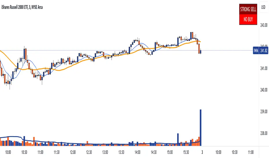
DTS- Dynamic Trend SignalDynamic Trend Signal
The Dynamic Trend Signal indicator is a powerful and highly customizable tool designed for traders who want clear and actionable signals to guide their trading decisions. This indicator leverages the relationship between two moving averages and the current price to provide concise buy/sell recommendations while visually enhancing your chart with professional-grade features.
Key Features:
Actionable Trading Signals:
STRONG BUY / NO SELL: When the price is above both moving averages.
BUY / NO SELL: When the price is above the longer moving average but below the shorter moving average.
NO BUY / SELL: When the price is below the longer moving average but above the shorter moving average.
STRONG SELL / NO BUY: When the price is below both moving averages.
Dynamic Signal Table:
Displays real-time trading signals in a convenient table format.
Automatically updates based on market conditions.
Customizable table position (top-left, top-right, bottom-left, or bottom-right).
Dynamic background and text colors for improved visibility:
Green shades for bullish signals.
Red shades for bearish signals.
Customizable Moving Averages:
Configure each moving average independently:
Choose between Simple Moving Average (SMA) and Exponential Moving Average (EMA).
Set unique lengths, colors, and line thickness for each average.
Default settings:
MA1: Short-term (8-period) with thickness 1.
MA2: Long-term (20-period) with thickness 2.
Optional Crossover Alerts:
Visual and textual alerts for moving average crossovers:
BUY: When the shorter moving average crosses above the longer moving average.
SELL: When the shorter moving average crosses below the longer moving average.
Crossover alerts are disabled by default but can be easily enabled in settings.
Ease of Use:
Intuitive interface with clean and professional visuals.
Fully customizable to fit any trading strategy or chart style.
How It Helps Traders:
The Dynamic Trend Signal simplifies market analysis by removing guesswork and focusing on clear, data-driven signals. Whether you're a beginner looking for straightforward guidance or an experienced trader seeking to enhance your strategy, this indicator provides:
Confidence in decision-making with clear buy/sell signals.
Customization to align with your unique trading approach.
Clarity through visually appealing, color-coded signals and alerts.
Ideal For:
Swing Traders
Day Traders
Trend Followers
Traders looking to integrate a dynamic, rule-based approach to their analysis.
How to Use:
Add the Dynamic Trend Signal indicator to your chart.
Adjust the moving average lengths, types, colors, and thickness to suit your trading strategy.
Monitor the signal table for actionable recommendations.
Optionally enable crossover alerts for real-time buy/sell notifications.
Unlock the power of clear and actionable trading signals with the Dynamic Trend Signal! Add it to your TradingView chart today and take your trading strategy to the next level.
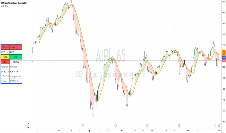
Another Brian"Another Brian" is an advanced TradingView indicator meticulously designed to offer traders a multifaceted analysis by integrating both technical and fundamental metrics. Unlike standard indicators, this script uniquely combines multi-period Moving Averages (SMA and WMA) with multi-day Volume-Weighted Average Prices (VWAPs) to accurately identify trend directions and potential support/resistance levels. It incorporates pivot points (S2 and R2) specifically calculated for intraday timeframes (1 to 14 minutes) to highlight key profit-taking areas tailored for day trading.
A standout feature of "Another Brian" is its dynamic background color coding, which changes based on the selected timeframe. This visual cue allows traders to instantly recognize the current trading context, enhancing situational awareness and decision-making efficiency.
On the fundamental side, the script evaluates dividend yield and dividend payout ratios, integrating these metrics with distribution data—crucial for ETFs where distributions may not appear as traditional dividends. By pulling and analyzing distribution information, "Another Brian" provides a more comprehensive yield assessment. This data is then compared to historical volatility (HV), enabling traders to gauge the stability and risk associated with their investments.
The indicator also features a comprehensive Risk-Adjusted Yield Ratio (RAYR), which compares the annualized distribution yield to its standard deviation. This ratio helps traders assess the efficiency of ETFs by balancing yield against volatility, highlighting investments that offer an optimal risk-return profile.
Central to the user experience is a dynamic data table that displays essential metrics such as 20-day Volume, ATR20, ADR20, moving averages status, yield ratios, and volatility measures. This table is color-coded for quick visual interpretation:
Setup : turn off the candle colors, the indicator draws price.
Red Indicators: Signal that a closer examination is needed, allowing traders to swiftly identify potential issues or opportunities.
Green and Yellow Indicators: Provide positive or neutral signals, aiding in the swift assessment of market conditions.
Additionally, "Another Brian" includes a trigger detection system that identifies potential bullish or bearish conditions based on the interaction between SMAs and WMAs across multiple timeframes. These triggers offer actionable trading signals, enhancing the tool's utility for both novice and experienced traders.
Key Features:
Moving Averages (MA):
Simple Moving Average (SMA): Calculates SMA over various periods (20-day, 50-day) to identify trend directions.
Weighted Moving Average (WMA): Computes WMA to give more significance to recent price data, aiding in trend detection.
Volume-Weighted Average Price (VWAP):
Multi-Day VWAPs: Plots VWAPs for 1-day, 2-day, and 3-day periods, helping traders identify potential support and resistance levels based on volume-weighted pricing.
Pivot Points:
Support (S2) and Resistance (R2): Calculates and plots key pivot points for intraday timeframes (1 to 14 minutes), assisting in identifying potential profit-taking zones for day trades.
Volatility Metrics:
Average True Range (ATR): Measures market volatility over a 20-day period.
Historical Volatility (HV): Assesses volatility over the past year, providing insights into price fluctuations.
Dividend and Distribution Analysis:
Dividend Yield & Payout Ratio: Displays current dividend yield and payout ratios as percentages.
Distribution Data: Integrates distribution information for ETFs, ensuring comprehensive yield analysis even when distributions don't appear as traditional dividends.
Risk-Adjusted Yield Ratio (RAYR):
RAYR Calculation: Compares the annualized distribution yield to its standard deviation, indicating the yield received for each unit of risk taken.
RAYR Indicators: Highlights ETFs with favorable RAYR values, aiding in identifying investments that offer a balanced risk-return profile.
Dynamic Data Table:
Comprehensive Metrics Display: Showcases key metrics such as 20-day Volume, ATR20, ADR20, moving averages status, yield ratios, and volatility measures.
Color-Coding: Utilizes color-coded elements to indicate the status of various metrics, enhancing visual interpretation and decision-making.
Quick View Alerts: Red indicators prompt traders to take a closer look, streamlining the analysis process.
Trigger Indicators:
Pre-Trigger Conditions: Identifies potential market triggers based on moving average crossovers and other predefined conditions.
Bullish and Bearish Conditions: Differentiates between bullish and bearish trends, providing visual cues for potential trade opportunities.
Background Color Coding:
Timeframe-Based Coloring: Changes the chart's background color based on the selected timeframe (e.g., yellow for 1-minute, blue for 5-minute), offering an immediate visual reference for the current trading context.
Usage Benefits:
Holistic Market Analysis: Combines technical indicators with fundamental metrics to provide a well-rounded view of stock performance.
Enhanced Decision-Making: Helps traders identify trends, volatility, and potential trade triggers, facilitating informed trading strategies.
Visual Clarity: Employs color-coded elements and a comprehensive data table to simplify complex data, making it easier to interpret market conditions at a glance.
Customization: Offers flexibility in selecting which VWAPs to display and allows for adjustments based on different timeframes and trading preferences.
Efficiency in Monitoring: The dynamic background and color-coded table enable quick assessments, saving traders time and enhancing responsiveness to market changes.
"Another Brian" is an invaluable tool for traders seeking to integrate multiple analytical perspectives into their trading routine. By providing deeper market insights through its unique combination of technical and fundamental metrics, along with intuitive visual cues, "Another Brian" empowers traders to make more informed and strategic decisions in the dynamic stock market environment.
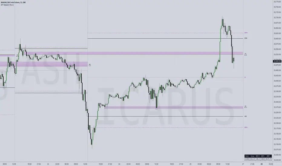
DTT Weekly Volatility Grid [Pro+] (NINE/ANARR)Introduction:
Automate Digital Time Theory (DTT) Weekly Models with the DTT Weekly Volatility Grid , leveraging the proprietary framework developed by Nine and Anarr. This tool allows to navigate the advanced landscape of Time-based statistical trading for futures, crypto, and forex markets.
Description:
Built on the Digital Time Theory (DTT), this script provides traders with a structured view of time and price interactions, ideal for swing insights. It divides the weekly range into Time models and inner intervals, empowering traders with data-driven insights to anticipate market expansions, detect Time-based distortions, and understand volatility fluctuations at specific Times during the trading week.
Key Features:
Time-Based Weekly Models and Volatility Awareness: The DTT Weekly Time Models automatically map onto your chart, highlighting critical volatility points in weekly sessions. These models help traders recognize potential shifts in the market, ideal for identifying larger, swing-oriented moves.
Average Model Range Probability (AMRP): The AMRP feature calculates the historical probability of reaching previous DTT Weekly Model Ranges. With AMRP and Standard Deviation metrics, traders can evaluate the likelihood of DTT model continuations or breaks, aligning their strategy with higher Timeframe volatility trends.
Root Candles and Liquidity Draws: Visualize Root Candles as liquidity draws, emphasizing premium and discount areas and marking the origin of a Time-based price movement. The tool allows traders to toggle features like opening prices and equilibrium points of each Root Candle. Observing accumulation or distribution zones around these candles provides crucial reference points for strategic swing entries and exits.
Extended Visualization of Weekly Model Ranges: Leverage previous weekly model ranges within the current Time model to observe historical high, low, and equilibrium levels. This feature aids traders in visualizing premium and discount ranges of prior models, pinpointing areas of liquidity and imbalance to watch.
Customization Options: Tailor Time intervals with a variety of line styles (solid, dashed, dotted) and colours to customize each model. Adjust settings to display specific historical weekly models, apply custom labels, and create a personalized view that suits your trading style and focus.
Lookback Periods and Model Count: Select customizable lookback periods to display past models, offering insights into market behaviour over a chosen historical range. This feature enables clean, organized charts and allows analysts to add more models for detailed backtesting and analysis.
Detailed Real-Time Data Table: The live data table provides easy access to AMRP and range data for selected models. This table highlights model targets and anticipated ranges, offering insights into whether previous models have exceeded historical volatility expectations or remained within them.
How Traders Can Use The DTT Weekly Volatility Grid Effectively:
Identifying Premium and Discount Zones: Track weekly ranges using Root Candles and previous model equilibrium levels to assess if prices are trading in premium or discount areas. This information helps framing the broader swing outlook.
Timing Trades Based on Volatility: Recognize potential exhaustion points through AMRP insights or completed model distortions that may signal new expansions. By observing inner intervals and Root Candles, traders can identify periods of high market activity, assisting in Timing weekly entries and exits.
Avoiding Low Volatility Phases: AMRP calculations can indicate periods when price action may slow or become choppy. If price remains within AMRP deviations or near them, traders can adjust risk or step aside, awaiting more favourable conditions for volatility-driven trades as new inner intervals or model roots appear.
Designed for Swing Traders and Higher Timeframes: The Weekly DTT Models are suited for those looking to study higher timeframe trends across futures, forex, and crypto markets. This tool equips traders with volatility-aware, and data-driven insights during extended market cycles.
Usage Guidance:
Add DTT Weekly Volatility Grid (NINE/ANARR) to your TradingView chart.
Customize your preferred time intervals, model history, and visual settings for your session.
Use the data table to track average model ranges and probabilities, ensuring you align your trades with key levels.
Incorporate DTT Weekly Volatility Grid (NINE/ANARR) into your existing strategies to fine-tune your view through based on data-driven insights into volatility and price behaviour.
Terms and Conditions
Our charting tools are products provided for informational and educational purposes only and do not constitute financial, investment, or trading advice. Our charting tools are not designed to predict market movements or provide specific recommendations. Users should be aware that past performance is not indicative of future results and should not be relied upon for making financial decisions. By using our charting tools, the purchaser agrees that the seller and the creator are not responsible for any decisions made based on the information provided by these charting tools. The purchaser assumes full responsibility and liability for any actions taken and the consequences thereof, including any loss of money or investments that may occur as a result of using these products. Hence, by purchasing these charting tools, the customer accepts and acknowledges that the seller and the creator are not liable nor responsible for any unwanted outcome that arises from the development, the sale, or the use of these products. Finally, the purchaser indemnifies the seller from any and all liability. If the purchaser was invited through the Friends and Family Program, they acknowledge that the provided discount code only applies to the first initial purchase of the Toodegrees Premium Suite subscription. The purchaser is therefore responsible for cancelling – or requesting to cancel – their subscription in the event that they do not wish to continue using the product at full retail price. If the purchaser no longer wishes to use the products, they must unsubscribe from the membership service, if applicable. We hold no reimbursement, refund, or chargeback policy. Once these Terms and Conditions are accepted by the Customer, before purchase, no reimbursements, refunds or chargebacks will be provided under any circumstances.
By continuing to use these charting tools, the user acknowledges and agrees to the Terms and Conditions outlined in this legal disclaimer.
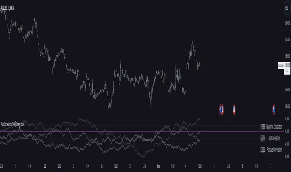
AutoCorrelation Test [OmegaTools]Overview
The AutoCorrelation Test indicator is designed to analyze the correlation patterns of a financial asset over a specified period. This tool can help traders identify potential predictive patterns by measuring the relationship between sequential returns, effectively assessing the autocorrelation of price movements.
Autocorrelation analysis is useful in identifying the consistency of directional trends (upward or downward) and potential cyclical behavior. This indicator provides an insight into whether recent price movements are likely to continue in a similar direction (positive correlation) or reverse (negative correlation).
Key Features
Multi-Period Autocorrelation: The indicator calculates autocorrelation across three periods, offering a granular view of price movement consistency over time.
Customizable Length & Sensitivity: Adjustable parameters allow users to tailor the length of analysis and sensitivity for detecting correlation.
Visual Aids: Three separate autocorrelation plots are displayed, along with an average correlation line. Dotted horizontal lines mark the thresholds for positive and negative correlation, helping users quickly assess potential trend continuation or reversal.
Interpretive Table: A table summarizing correlation status for each period helps traders make quick, informed decisions without needing to interpret the plot details directly.
Parameters
Source: Defines the price source (default: close) for calculating autocorrelation.
Length: Sets the analysis period, ranging from 10 to 2000 (default: 200).
Sensitivity: Adjusts the threshold sensitivity for defining correlation as positive or negative (default: 2.5).
Interpretation
Above 50 + Sensitivity: Indicates Positive Correlation. The price movements over the selected period are likely to continue in the same direction, potentially signaling a trend continuation.
Below 50 - Sensitivity: Indicates Negative Correlation. The price movements show a likelihood of reversing, which could signal an upcoming trend reversal.
Between 50 ± Sensitivity: Indicates No Correlation. Price movements are less predictable in direction, with no clear trend continuation or reversal tendency.
How It Works
The indicator calculates the logarithmic returns of the selected source price over each length period.
It then compares returns over consecutive periods, categorizing them as either "winning" (consistent direction) or "losing" (inconsistent direction) movements.
The result for each period is displayed as a percentage, with values above 50% indicating a higher degree of directional consistency (positive or negative).
A table updates with descriptive labels (Positive Correlation, Negative Correlation, No Correlation) for each tested period, providing a quick overview.
Visual Elements
Plots:
AutoCorrelation Test : Displays autocorrelation for the closest period (lag 1).
AutoCorrelation Test : Displays autocorrelation for the second period (lag 2).
AutoCorrelation Test : Displays autocorrelation for the third period (lag 3).
Average: Displays the simple moving average of the three test periods for a smoothed view of overall correlation trends.
Horizontal Lines:
No Correlation (50%): A baseline indicating neutral correlation.
Positive/Negative Correlation Thresholds: Dotted lines set at 50 ± Sensitivity, marking the thresholds for significant correlation.
Usage Guide
Adjust Parameters:
Select the Source to define which price metric (e.g., close, open) will be analyzed.
Set the Length based on your preferred analysis window (e.g., shorter for intraday trends, longer for swing trading).
Modify Sensitivity to fine-tune the thresholds based on market volatility and personal trading preference.
Interpret Table and Plots:
Use the table to quickly check the correlation status of each lag period.
Analyze the plots for changes in correlation. If multiple lags show positive correlation above the sensitivity threshold, a trend continuation may be expected. Conversely, negative values suggest a potential reversal.
Integrate with Other Indicators:
For enhanced insights, consider using the AutoCorrelation Test indicator in conjunction with other trend or momentum indicators.
This indicator offers a powerful method to assess market conditions, identify potential trend continuations or reversals, and better inform trading decisions. Its customization options provide flexibility for various trading styles and timeframes.
Weekly High/Low Day BreakdownThe "Weekly High/Low Day Breakdown" is a tool designed to help identify patterns in market behaviour by analysing the days of the week when weekly highs and lows occur. This indicator calculates the frequency and percentage of weekly highs and lows for each day from Monday to Sunday within the visible range of your chart.
Features:
Weekly Analysis: Calculates weekly highs and lows based on daily open high and low prices from Monday to Sunday.
Day-Specific Breakdown: Tracks which day of the week each weekly high and low occurred.
Visible Range Focus: Only considers data within the current visible range of your chart for precise analysis.
Interactive Table Display: Presents the results in an easy-to-read table directly on your chart.
How It Works:
Data Collection: Fetches daily high, low, day of the week, and time data regardless of your chart's timeframe. Uses these daily figures to determine the weekly high and low for each week.
Weekly Tracking: Monitors the day of the week when the weekly high and low prices occur. Resets tracking at the end of each week (Sunday).
Visible Range Analysis: Only includes weeks that fall entirely within the visible time range of your chart. Ensures that the analysis is relevant to the period you are focusing on.
Percentage Calculation: Counts the occurrences of weekly highs and lows for each day. Calculates the percentage based on the total number of weeks in the visible range.
Result Display: Generates a table with days of the week as columns and "Weekly High" and "Weekly Low" as rows. Displays the percentage values, indicating how often highs and lows occur on each day.
How to Use:
Add the Indicator: Apply the "Weekly High/Low Day Breakdown" indicator to your TradingView chart.
Adjust Visible Range: Zoom in or out to set the desired visible time range for your analysis.
Interpret the Table:
Columns: Represent days from Monday to Sunday.
"Weekly High" Row: Shows the percentage of times the weekly high occurred on each day. "Weekly Low" Row: Shows the percentage of times the weekly low occurred on each day.
Colors: Blue text indicates high percentages, red text indicates low percentages.
Example Interpretation:
If the table shows a 30% value under "Tuesday" for "Weekly High," it means that in 30% of the weeks within the visible range, the highest price of the week occurred on a Tuesday.
Similarly, a 40% value under "Friday" for "Weekly Low" indicates that 40% of the weekly lows happened on a Friday.

Sector Trend MapThe Sector Trend Map is a powerful tool designed to provide a sentiment heatmap for major market sectors. This indicator tracks the average trend direction across 11 key sectors, including Technology, Financials, Healthcare, Energy, and more. By monitoring each sector's sentiment, the Sector Trend Map helps traders quickly assess whether sectors are bullish or bearish, allowing for better-informed trading decisions.
This indicator plots a visual heatmap showing the sentiment strength for each sector on a scale from 0 to 100. The colors range from green for bullish sentiment to red for bearish sentiment. Additionally, it displays a real-time percentage of sectors that are bullish and bearish in a dynamic table located in the bottom right corner of the chart.
This indicator simplifies sector sentiment analysis by providing clear visual cues, making it easy to stay on top of market dynamics and make data-driven trading decisions.
Key Features:
Sentiment Heatmap: Displays a heatmap of sector sentiment ranging from bullish (green) to bearish (red).
Bullish/Bearish Percentages: A dynamic table showing the percentage of sectors that are bullish or bearish.
Tracks 11 Key Sectors: Monitors sectors such as Technology, Financials, Energy, Healthcare, and more.
Simple and Clear Visuals: Provides easy-to-read color coding for quick decision-making.
Customizable Moving Averages: Select between SMA, EMA, WMA, or DEMA for the trend calculation.
Market Hours Sensitivity: Indicator operates during regular market hours, ensuring relevance for day traders and active traders.
Overlay Sentiment Colors on Candles:
This feature allows you to overlay the sentiment (green for bullish, red for bearish) directly onto the price chart candles. You can enable or disable this option based on your preference.
How to Use the Sector Trend Map:
The heatmap is divided into different sectors. Each sector is colored based on its current sentiment:
🟢 Green (Bullish sentiment)
🔴 Red (Bearish sentiment)
Sentiment is calculated on a scale from 0 to 100, with 50 being the neutral point. Sectors above 50 are bullish, while sectors below 50 are bearish.
Bullish/Bearish Percentage Table:
A table is displayed in the bottom right corner of the screen, showing the percentage of sectors that are currently bullish and bearish.
Bullish %: The percentage of sectors above 50 on the sentiment scale.
Bearish %: The percentage of sectors below 50 on the sentiment scale.
Market Hours Activity:
The indicator only calculates and displays data during market hours (09:30 AM to 4:00 PM EST), ensuring it stays relevant to intraday trading. Outside of market hours, the indicator remains inactive.
Best Used For:
Intraday Traders: Get real-time sector sentiment during market hours and make better trading decisions based on sector strength or weakness.
Swing Traders: Monitor sector trends to spot shifts in market sentiment over time.
Sector Rotation Strategies: Use the indicator to identify which sectors are gaining or losing strength, aiding in sector rotation strategies.
Practical Example:
If 7 out of the 11 sectors display a bullish sentiment, the table will show 63.64% as bullish and 36.36% as bearish. The heatmap will show green sectors for those above the 50 sentiment threshold, allowing you to visually spot the sectors leading the market.
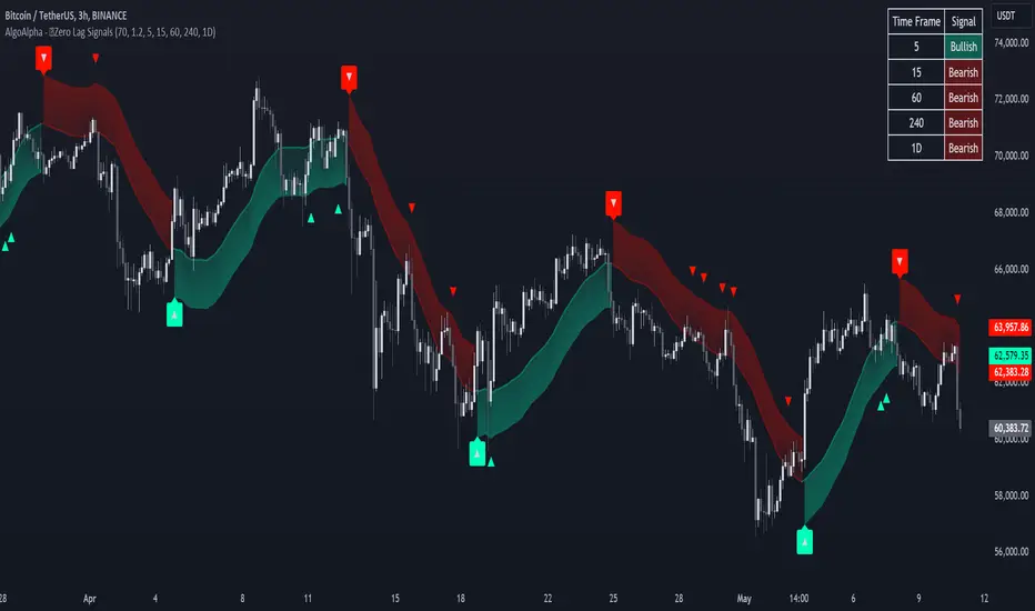
Zero Lag Trend Signals (MTF) [AlgoAlpha]Zero Lag Trend Signals 🚀📈
Ready to take your trend-following strategy to the next level? Say hello to Zero Lag Trend Signals , a precision-engineered Pine Script™ indicator designed to eliminate lag and provide rapid trend insights across multiple timeframes. 💡 This tool blends zero-lag EMA (ZLEMA) logic with volatility bands, trend-shift markers, and dynamic alerts. The result? Timely signals with minimal noise for clearer decision-making, whether you're trading intraday or on longer horizons. 🔄
🟢 Zero-Lag Trend Detection : Uses a zero-lag EMA (ZLEMA) to smooth price data while minimizing delay.
⚡ Multi-Timeframe Signals : Displays trends across up to 5 timeframes (from 5 minutes to daily) on a sleek table.
📊 Volatility-Based Bands : Adaptive upper and lower bands, helping you identify trend reversals with reduced false signals.
🔔 Custom Alerts : Get notified of key trend changes instantly with built-in alert conditions.
🎨 Color-Coded Visualization : Bullish and bearish signals pop with clear color coding, ensuring easy chart reading.
⚙️ Fully Configurable : Modify EMA length, band multiplier, colors, and timeframe settings to suit your strategy.
How to Use 📚
⭐ Add the Indicator : Add the indicator to favorites by pressing the star icon. Set your preferred EMA length and band multiplier. Choose your desired timeframes for multi-frame trend monitoring.
💻 Watch the Table & Chart : The top-right table dynamically updates with bullish or bearish signals across multiple timeframes. Colored arrows on the chart indicate potential entry points when the price crosses the ZLEMA with confirmation from volatility bands.
🔔 Enable Alerts : Configure alerts for real-time notifications when trends shift—no need to monitor charts constantly.
How It Works 🧠
The script calculates the zero-lag EMA (ZLEMA) by compensating for data lag, giving traders more responsive moving averages. It checks for volatility shifts using the Average True Range (ATR), multiplied to create upper and lower deviation bands. If the price crosses above or below these bands, it marks the start of new trends. Additionally, the indicator aggregates trend data from up to five configurable timeframes and displays them in a neat summary table. This helps you confirm trends across different intervals—ideal for multi-timeframe analysis. The visual signals include upward and downward arrows on the chart, denoting potential entries or exits when trends align across timeframes. Traders can use these cues to make well-timed trades and avoid lag-related pitfalls.
Implied Volatility WallsThe Implied Volatility Walls (IVW) indicator is a powerful and advanced trading tool designed to help traders identify key market zones where price may encounter significant resistance or support based on volatility. Using implied volatility, historical volatility, and machine learning models, IVW provides traders with a comprehensive understanding of market dynamics. This indicator is especially useful for those who wish to forecast volatility-driven price movements and adjust their trading strategies accordingly.
How the Implied Volatility Walls (IVW) Works:
The Implied Volatility Walls (IVW) indicator uses a combination of historical price data and advanced machine learning algorithms to calculate key volatility levels and forecast future market conditions. It tracks cumulative volatility, identifies support and resistance zones, and detects liquidation bubbles to highlight critical price areas.
The main concept behind this tool is that price tends to move most of the time by the same amount, making it possible to average the past maximum excursion in order to obtain a validated area where traders can be able to see clearly that the price is moving more than normal.
This indicator primarily focuses on:
1. Volatility Zones: Potential support and resistance levels based on implied and historical volatility.
2. Machine Learning Volatility Forecast: A machine learning model that predicts high, medium, or low volatility for future market conditions.
3. Liquidation Detection: Highlights key areas of potential forced liquidations, where market participants may be forced out of their positions, often leading to significant price movements.
4. Backtesting and Win Rate: The indicator continuously monitors how effective its volatility-based predictions are, offering insights into the performance of its predictions.
Key Features:
1. Volatility Tracking:
- The IVW indicator calculates cumulative volatility by analyzing the range between the high and low prices over time. It also tracks volatility percentiles and separates the market conditions into high, medium, or low volatility zones, enabling traders to gauge how volatile the market is.
2. Volatility Walls (Upper and Lower Zones):
- Upper Volatility Wall (Red Zones): Represent resistance levels where the price might encounter difficulty moving higher due to excess in volatility. This zone is calculated based on the chosen percentile in the settings.
- Lower Volatility Wall (Blue Zones): Represent support levels where price may find buying support.
- These walls help traders visualize potential zones where reversals or breakouts could occur based on volatility conditions.
3. Machine Learning Forecast:
- One of the standout features of the IVW indicator is its machine learning algorithm that estimates future volatility levels. It categorizes volatility into high, medium, and low based on recent data and provides forecasts on what the next market condition is likely to be.
- This forecast helps traders anticipate market conditions and adapt their strategies accordingly. It is displayed on the chart as "Exp. Vol", providing insight into the future expected volatility.
4. VIX Adjustments:
- The indicator can be adjusted using the well-known **VIX (Volatility Index)** to further refine its volatility predictions. This enables traders to incorporate market sentiment into their analysis, improving the accuracy of the predictions for different market conditions.
5. Liquidation Bubbles:
- The Liquidation Bubbles feature highlights areas where large forced selling or buying events may occur, which are usually accompanied by spikes in volatility and volume. These bubbles appear when price deviates significantly from moving averages with substantial volume increases, alerting traders to potential volatile moves.
- Red dots indicate likely forced liquidations on the upside, and blue dots indicate forced liquidations on the downside. These bubbles can help traders spot moments of market stress and potential price swings due to liquidations.
6. Dynamic Volatility Zones:
- IVW dynamically adjusts support and resistance levels as market conditions evolve. This allows traders to always have up-to-date and relevant information based on the latest volatility patterns.
7. Cumulative Volatility Histogram:
- At the bottom of the chart, the purple histogram represents cumulative volatility over time, giving traders a visual cue of whether volatility is building up or subsiding. This can provide early signals of market transitions from low to high volatility, aiding traders in timing their entries and exits more accurately.
8. Backtesting and Win Rate:
- The IVW indicator includes a backtesting function that monitors the success of its volatility predictions over a selected period. It shows a Win Rate (WR) percentage (with 33% meaning that the machine learning algorithm does not bring any edge), representing how often the indicator's predictions were correct. This metric is crucial for assessing the reliability of the model’s forecasts.
9. Opening Range:
- At the beginning of a new session, the indicator will plot two lines indicating the high and the low of the first candle of the new time frame chosen.
Chart Breakdown:
Below is a description of what users see when using the Implied Volatility Walls (IVW) indicator on the chart:
Volatility Walls:
- Red shaded zones at the top represent upper volatility walls (resistance zones), while blue shaded zones at the bottom represent lower volatility walls (support zones). These areas show where price is likely to react due to high or low volatility conditions.
Liquidation Bubbles:
- Red and blue dots plotted above and below the price represent **liquidation bubbles**, indicating moments of market stress where volatility and volume spikes may force market participants to exit positions.
Cumulative Volatility Histogram:
- The purple histogram at the bottom of the chart reflects the buildup of cumulative volatility over time. Higher bars suggest increased volatility, signaling the potential for large price movements, while smaller bars represent calmer market conditions.
Real-Time Support and Resistance Levels:
- Solid and dashed lines represent current and historical support and resistance levels, helping traders identify price zones that have historically acted as volatility-driven turning points.
Gradient Bar Colors:
- The price bars change color based on their proximity to the volatility walls, with different colors representing how close the price is to these key levels. This color gradient provides a quick visual cue of potential market turning points.
Data Tables Explained:
Table 1: **Volatility Information Table (Top Right Corner):
- EV: Expected Volatility (based on the VIX FIX calculation from Larry Williams).
- +V and -V: Represents the adjusted volatility for upward (+V) and downward (-V) movements.
- Exp. Vol: Shows the expected volatility condition for the next period (High, Medium, or Low) based on the machine learning algorithm.
- WR: The Win Rate based on the backtesting of previous volatility predictions (three outcomes, so base Win rate is 33%, and not 50%).
Table 2: Expected Cumulative Range (Top Right Corner of the separated pane):
- Exp. CR: Expected Cumulative Range based on a machine learning algorithm that calculate the most likely outcome (cumulative range) based on the past days and metrics.
How to Use the Indicator:
1. Identify Key Support and Resistance Levels:
- Use the upper (red) and lower (blue) volatility walls to identify zones where the price is likely to face resistance or support due to volatility dynamics.
2. Forecast Future Volatility:
- Pay attention to the Expected Vol field in the table to understand whether the machine learning model predicts high, medium, or low volatility for the next trading session.
3. Monitor Liquidation Bubbles:
- Watch for red and blue bubbles as they can signal significant market events where volatility and volume spikes may lead to sudden price reversals or continuations.
4. Use the Histogram to Gauge Market Conditions:
- The cumulative volatility histogram shows whether the market is entering a high or low volatility phase, helping you adjust your risk accordingly and making you able to identify the potential of the rest of the chosen session.
5. Backtesting Confidence:
- The Win Rate (WR) provides insight into how reliable the indicator’s predictions have been over the backtested period, giving you additional confidence in its future forecasts, remember that considering the 3 scenarios possible (high volatility, medium and low volatility), the standard win rate is 33%, and not 50%!.
Final Notes:
The Implied Volatility Walls (IVW) indicator is a powerful tool for volatility-based analysis, providing traders with real-time data on potential support and resistance levels, liquidation bubbles, and future market conditions. By leveraging a machine learning model for volatility forecasting, this tool helps traders stay ahead of the market’s volatility patterns and make informed decisions.
Disclaimer: This tool is for educational purposes only and should not be solely relied upon for trading decisions. Always perform your own research and risk management when trading.

Candle Data AnalyzerCandle Data Analyzer
Overview
The Candle Data Analyzer is a powerful TradingView script designed to provide traders with insights into price action patterns within specific time sessions. By analyzing historical candle data, this indicator offers predictive suggestions for future price movements, helping traders make more informed decisions.
Key Features
**Custom Session Analysis**: Analyze price action within user-defined time sessions.
**Bias Selection**: Choose between Bullish, Bearish, or Neutral bias for predictions.
**Daily/Weekly Toggle**: Option to use daily or weekly results for broader context.
**Visual Predictions**: Display predicted high, low, and open levels for the next session.
**Detailed Statistics**: View average time and price movements for highs and lows.
**Interactive Table**: Optional table display showing current and historical data.
How It Works
1. The script collects and analyzes candle data from user-defined sessions.
2. It calculates average time and price movements for highs and lows.
3. Based on the selected bias, it predicts the next session's open, high, and low levels.
4. These predictions are visually represented on the chart using colored lines.
5. A detailed statistics table can be displayed for in-depth analysis.
Usage Guide
Setup
1. Add the indicator to your chart.
2. Configure the session time in the format "HHMM-HHMM" (e.g., "0300-0500" for 3:00 AM to 5:00 AM).
3. Select your bias: Bullish, Bearish, or Neutral.
4. Choose whether to use daily results or not.
5. Decide if you want to display the detailed statistics table.
Interpreting the Results
**Blue Line**: Open level for the next session.
**Green Line**: Predicted high level for the next session.
**Red Line**: Predicted low level for the next session.
**Vertical Lines**: Estimated times for the high (green) and low (red) to occur.
Using the Statistics Table
If enabled, the table provides:
- Previous session's OHLC data with timestamps.
- Average price movements (as percentages) from open to high and open to low.
- Average time for highs and lows to occur (in minutes).
- Count of analyzed candles matching the selected bias.
Trading Applications
**Session Trading**: Use predictions to plan entries and exits for session-based trading strategies.
**Risk Management**: Set stop-loss and take-profit levels based on predicted price ranges.
**Trend Analysis**: Compare current price action to predicted levels to gauge trend strength.
**Time-Based Strategies**: Utilize timing predictions for high-probability trade entries.
Best Practices
- Combine this indicator with other technical analysis tools for confirmation.
- Regularly adjust the session times and bias to adapt to changing market conditions.
- Use the statistics table to gain deeper insights into historical price patterns.
- Remember that predictions are based on averages and should not be considered guaranteed outcomes.
Conclusion
The Candle Data Analyzer offers a unique approach to understanding and predicting price action within specific time frames. By leveraging historical data and user-defined parameters, it provides traders with valuable insights to enhance their trading strategies and decision-making processes.
Future Developments
- Weekly and Daily Projections
- User defined line styles
DTT Volatility Grid [Pro+] (NINE/ANARR)Introduction:
This tool is designed to automate the Digital Time Theory (DTT) framework created by Ivan and Anarr, and leverage the DTT Volatility Grid to navigate the advanced realm of Time-based statistical trading.
Description:
Built upon the proprietary Digital Time Theory (DTT), this script equips traders with an edge in analyzing Time and price-based market behaviour. It is designed for intraday traders of all asset classes, and breaks down the entire Daily range into Time Models and Inner Time Intervals. This tool is powered by data-driven insights, helping traders anticipate expansions, understand Time distortions, and assess market volatility at specific Times of the trading day.
Key Features:
Time-Based Models and Volatility Awareness: The indicator automatically populates the chart with DTT's Time Models. These Time Models, represented by specific Time Intervals, are engineered to highlight volatility injections within key sessions, offering traders clear insights into market dynamics and potential shifts.
Average Model Range Probability (AMRP): Know the average volatility expected for specific Time Models and use AMRP Levels (and Standard Deviation) to gauge the probability of a range break or failure, based on historical price action and Time data.
Root Candles and Liquidity Draws: Visualize Root Candles as draws on liquidity, showcasing premium and discount areas, and the starting point of a Time based price movement. Understand how the opening price and equilibrium of each Root Candle can serve as a framework for your trade executions. Distribution or accumulation above or below Root Candles can also be observed and utilized.
Extended Visualization: Observe prior Model Ranges into the current Time Model, including the High, Low, and Equilibrium from the previous Time Models, helping traders visualize potential support or resistance areas.
Lookback Periods and Model Count: Use customizable lookback periods to adjust the number of past models, providing further insight into market behaviour over a chosen historical range. This can help to keep charts clean and organized with one model displayed or multiple for backtesting purposes.
Detailed Data Table: The real-Time data table allows traders to view the AMRP and range data for selected models, providing an easy reference for model behaviour and volatility dynamics. The table can depict all Time Model average ranges for reference and study, providing insights to whether the previous models have exceeded their historical range volatility, or not.
Customization Options: Customize Time Intervals with various styles (solid, dashed, dotted) and choose different colors for each model or interval. You can also select which historical models to display, alongside customizable labels.
How Traders Can Use DTT Volatility Grid Effectively:
Understand Premium and Discount Areas: By tracking Time-based ranges and using DTT's Root Candles and Previous Model Equilibrium, traders can quickly assess whether price is trading in premium or discount territory during intraday sessions.
Expecting Volatility and Time-Sensitive Trades: Knowing when a move is nearing exhaustion or when Time-based distortions are likely to cause an expansion allows traders to stay ahead of sudden market shifts. The Inner Intervals and Root Candles in combination, highlight the volatility ranges across various Timeframes, giving traders insights into which Times of the day are likely to experience heightened market activity as per DTT.
Avoiding Low Volatility Periods: The AMRP system helps traders identify times of the day where price action is likely to slow down or become choppy, encouraging traders to step aside or reduce risk during these times. If the AMRP was extended above the average of the previous Time model and the current model depicts an average range probability of low volatility, then traders can sit out in anticipation for a model with higher volatility.
Usage Guidance:
Add DTT Volatility Grid (NINE/ANARR) to your TradingView chart.
Customize your preferred time intervals, model history, and visual settings for your session.
Use the data table to track average model ranges and probabilities, ensuring you align your trades with key levels.
Incorporate DTT Volatility Grid (NINE/ANARR) into your existing strategies to fine-tune your entries and exits based on data-driven insights into volatility and price behaviour.
These tools are available ONLY on the TradingView platform.
Terms and Conditions
Our charting tools are products provided for informational and educational purposes only and do not constitute financial, investment, or trading advice. Our charting tools are not designed to predict market movements or provide specific recommendations. Users should be aware that past performance is not indicative of future results and should not be relied upon for making financial decisions. By using our charting tools, the purchaser agrees that the seller and the creator are not responsible for any decisions made based on the information provided by these charting tools. The purchaser assumes full responsibility and liability for any actions taken and the consequences thereof, including any loss of money or investments that may occur as a result of using these products. Hence, by purchasing these charting tools, the customer accepts and acknowledges that the seller and the creator are not liable nor responsible for any unwanted outcome that arises from the development, the sale, or the use of these products. Finally, the purchaser indemnifies the seller from any and all liability. If the purchaser was invited through the Friends and Family Program, they acknowledge that the provided discount code only applies to the first initial purchase of the Toodegrees Premium Suite subscription. The purchaser is therefore responsible for cancelling – or requesting to cancel – their subscription in the event that they do not wish to continue using the product at full retail price. If the purchaser no longer wishes to use the products, they must unsubscribe from the membership service, if applicable. We hold no reimbursement, refund, or chargeback policy. Once these Terms and Conditions are accepted by the Customer, before purchase, no reimbursements, refunds or chargebacks will be provided under any circumstances.
By continuing to use these charting tools, the user acknowledges and agrees to the Terms and Conditions outlined in this legal disclaimer.

Stock Info By IT Wala
Purpose of the Indicator
The "Stock Info by IT Wala" indicator was created to display essential stock-related information directly on the chart in a clear and concise manner. This is helpful for traders who want to quickly access details about a stock without having to look them up separately. It is useful for all types of market participants, whether trading stocks, indices, or other financial instruments, and provides an overview of the stock’s attributes such as its country, exchange, industry, and more.
Key Features
Displays a table containing key stock data, such as the stock’s name, country of origin, exchange, industry, sector, and type.
Shows additional details such as stock description, currency, and time zone, all sourced directly from syminfo.
Overlay feature allows the table to appear on the chart itself, making the information easily accessible while analyzing price action.
The table is customizable for style, with a navy blue background, white text, and border customization to match different charting themes.
Inputs (User Parameters)
This indicator doesn't offer customizable user inputs since it automatically pulls stock information from TradingView’s syminfo system. It ensures simplicity in use, allowing traders to focus on the provided data.
Output (How to Read the Indicator)
The output of the "Stock Info by IT Wala" indicator is a table that appears on the chart, showing:
Stock: The stock’s root symbol, such as AAPL for Apple or TSLA for Tesla.
Country: The country where the stock is listed or operates primarily.
Exchange: The prefix of the stock's exchange (e.g., NASDAQ, NYSE).
Industry: The industry to which the stock belongs, such as Technology, Healthcare, or Finance.
Sector: The broader sector, like Consumer Goods or Energy.
Type: Indicates whether the asset is a stock, index, or another type of financial asset.
Description: A brief description of the company or asset.
Currency: The currency in which the stock is traded (e.g., USD, EUR).
Timezone: The timezone of the exchange where the stock is listed.
Best Practices for Usage
Timeframes: This indicator works well across all timeframes, as it only displays stock-related data and is not affected by time-based analysis.
Asset Classes: It’s best suited for use with stocks but can also be applied to other types of assets (such as indices or commodities) where syminfo data is available.
Usage: Use this indicator to quickly review stock information while analyzing price action or planning trades. It is particularly helpful for traders who want quick access to contextual information without switching between different tools.
Limitations and Disclaimers:
The information is sourced directly from TradingView's syminfo and is limited to the data provided by TradingView. If any information is missing or incorrect, it will reflect in the table.
The indicator is purely informational and does not provide any buy or sell signals. Traders should not rely solely on this indicator for decision-making.
Limitations: This indicator does not work for every asset class. For example, it may not display detailed information for cryptocurrencies or certain less common instruments.
Alerts:
This indicator does not include any alert functionality since it is meant to display static stock data, not trigger trading signals.
Customization Options:
Table Styling: While users can't adjust the data displayed, the indicator automatically applies a styled table with a navy blue background and white borders to ensure readability. Users can modify this part of the code if needed for better chart integration.
Backtesting and Performance:
Backtesting is not applicable here as the indicator provides static information about the stock rather than dynamic data or signals. Performance is based on the data retrieval capabilities of TradingView's syminfo feature.
Conclusion:
The "Stock Info by IT Wala" indicator provides traders with instant access to crucial stock-related data, allowing them to review key details about the asset they are analyzing without leaving the chart. By offering details such as stock name, exchange, sector, and more, it makes fundamental information conveniently accessible, enhancing the charting experience.
Disclaimer:
This indicator is for informational purposes only and does not provide trading advice or recommendations. The stock data is sourced from TradingView’s systems and should be cross-verified if used for making trading decisions. Always conduct your own research and consult financial experts before executing any trades.
Importance of Clarity and Transparency:
When publishing a script, especially one like this that provides essential stock information, it's important to clearly explain its purpose, limitations, and intended usage. A transparent description ensures users understand what the indicator does and how to use it effectively in their analysis, preventing confusion or misuse. Clear communication builds trust with your audience and encourages responsible use of the tool.

Navid-MASummary of the Pine Script "Navid-MA":
The "Navid-MA" Pine Script is a custom indicator designed to enhance technical analysis by plotting two moving averages (MA7 and MA20) on a TradingView chart, while also providing real-time insights into the relationship between these moving averages. The indicator includes:
MA7 and MA20 Plotting:
MA7 is plotted in yellow with a thickness of 2.
MA20 is plotted in blue with a thickness of 3.
Delta Calculation:
The script calculates the difference (delta) between MA7 and MA20, rounded to two decimal places.
Threshold-Based Analysis:
Users can define a threshold based on time (in minutes) or bars to analyze recent market trends.
The script identifies the maximum and minimum delta values within this threshold.
Comprehensive Data Table:
A single table displays the current delta, maximum delta, and minimum delta, all in one row.
An additional row in the table indicates the direction of the current delta relative to the maximum delta using upward (↑) and downward (↓) arrows.
Usefulness for Publishing:
This Pine Script is highly useful for traders and analysts who want to:
Visualize Short-Term Trends:
By comparing MA7 and MA20, traders can quickly identify short-term trend shifts and potential entry/exit points.
Monitor Market Momentum:
The delta values provide insights into the momentum of the market, helping traders gauge the strength or weakness of the current trend.
Customizable Analysis:
The script's ability to adjust the threshold based on time or bars allows for flexible analysis, catering to both intraday and swing traders.
Clear and Concise Data Representation:
The table's format, with one row summarizing key metrics, ensures that traders can easily digest critical information without cluttering the chart.
Direction Indicator:
The arrow in the table serves as a quick visual cue, showing whether the current market momentum is increasing or decreasing relative to the recent maximum, aiding in decision-making.
Results:
This script offers a powerful yet straightforward tool for technical analysis. Its user-friendly design and immediate visual feedback make it a valuable addition to any trader's toolkit, particularly for those focused on momentum trading. Publishing this script on TradingView could attract a wide audience of traders looking for an intuitive way to monitor and analyze short-term market trends. The script's flexibility and clear data presentation make it appealing for both novice and experienced traders.

Volume Insignts AnalyzerDescription:
The Volume Insight Analyzer is an advanced Pine Script designed for traders who want a comprehensive view of volume dynamics on their charts. This script combines multiple volume-based indicators to help identify key trading opportunities, including significant volume days, volume dry-ups, and pocket pivots.
Key Features:
VDU (Volume Dry-Up) Detection: Automatically identifies and marks days when the volume is significantly below its moving average, helping to spot potential breakout or breakdown points. Customizable volume thresholds allow for tailored analysis based on your trading strategy. The Volume Dry-Up label appears when the volume is substantially below its average level and the price is near a key moving average. This condition indicates a period of equilibrium between supply and demand, suggesting a potential low-risk entry point for traders.
Pocket Pivot Analysis using 5 and 10 Length Pocket Pivots: Highlights days with exceptionally high volume compared to recent history, indicating potential pocket pivots. Visual markers on the chart and volume bars color-coded for 5 and 10-day lengths. Pocket pivot points are identified when the volume on a given day exceeds the maximum volume observed over the past several days. Specifically, a 5-day pocket pivot point is marked when today's volume surpasses the highest selling volume of the last 5 days. A cluster of 5-day pocket pivot points within a base is a strong indicator of stock strength. Similarly, a 10-day pocket pivot point following a Volume Dry-Up (VDU) suggests a potential entry opportunity. Moreover, a pre-existing cluster of 5-day pocket pivot points before a 10-day pocket pivot point provides greater conviction in the trade.
Volume Moving Averages: Set different lengths for primary and secondary moving averages to track volume trends over daily, weekly, and monthly timeframes. Options to display moving average lines on the volume chart.
Volume Visualization:
a. Major and Minor Volume Bars: Option to display bars that are either above or below average volume levels. Adjustable settings to show or hide these bars based on user preference.
b. Volume Bar Coloring: Volume bars are color-coded based on significant volume thresholds, including green for bullish signals, red for bearish signals, and orange for volume dry-ups.
Volume Metrics Table: A customizable table that displays real-time volume metrics including Relative Volume (RVOL), Turnover, and the number of high volume days. The table can be oriented horizontally or vertically and styled according to your theme preferences.
Visual Indicators:
a) Volume Dry-Up (VDU) Labels: Clearly marked VDU events with textual annotations on the chart.
b) Bullish and Bearish Arrows: Arrows indicating potential bullish or bearish closes based on volume analysis, enhancing decision-making.
Customization Options:
a) Dark and Light Theme Support: Toggle between dark and light themes to match your chart settings.
b) Adjustable Parameters: Easily configure input settings such as volume thresholds, MA lengths, and table display options to fit your trading style.
How to Use:
Set Parameters: Adjust the script settings such as volume thresholds, moving average lengths, and display preferences according to your analysis needs.
Analyze Volume Patterns: Use the indicators and visual markers provided by the script to identify significant volume patterns and potential trading signals.
Monitor Metrics: Refer to the volume metrics table for a quick overview of key volume-related statistics and trends.
Make Informed Decisions: Utilize the visual cues and volume data provided by the script to enhance your trading strategy and make more informed decisions.
Disclaimer:
This script is for informational purposes only and should not be considered as trading advice. Use it in conjunction with other analysis tools and consult with a financial advisor if needed. Trading involves risk, and past performance does not guarantee future results.
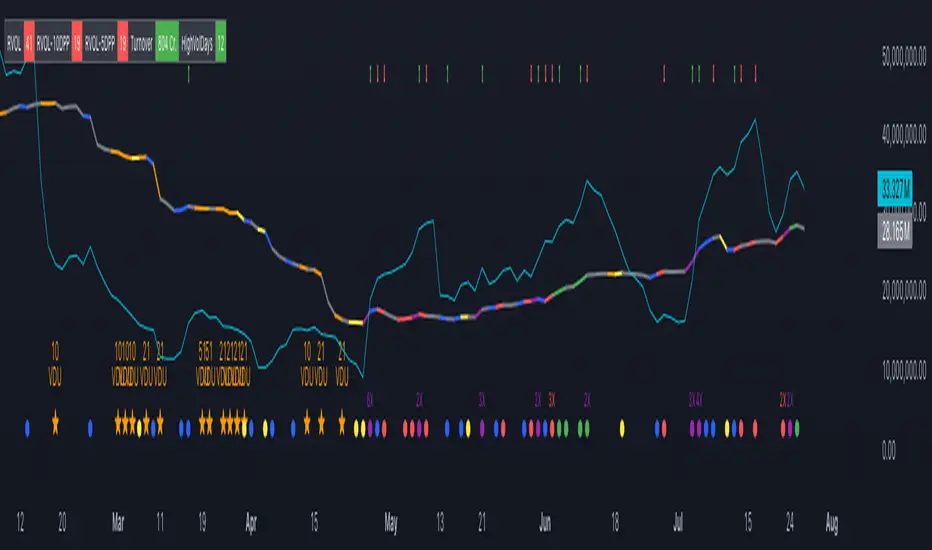
Trend DetectorThe Trend Detector indicator is a powerful tool to help traders identify and visualize market trends with ease. This indicator uses multiple moving averages (MAs) of different timeframes to provide a comprehensive view of market trends, making it suitable for traders of all experience levels.
█ USAGE
This indicator will automatically plot the chosen moving averages (MAs) on your chart, allowing you to visually assess the trend direction. Additionally, a table displaying the trend data for each selected MA timeframe is included to provide a quick overview.
█ FEATURES
1. Customizable Moving Averages: The indicator supports various types of moving averages, including Simple (SMA) , Exponential (EMA) , Smoothed (RMA) , Weighted (WMA) , and Volume-Weighted (VWMA) . You can select the type and length for each MA.
2. Multiple Timeframes: Plot moving averages for different timeframes on a single chart, including fast (short-term) , mid (medium-term) , and slow (long-term) MAs.
3. Trend Detector Table: A customizable table displays the trend direction (Up or Down) for each selected MA timeframe, providing a quick and easy way to assess the market's overall trend.
4. Customizable Appearance: Adjust the colors, frame, border, and text of the Trend Detector Table to match your chart's style and preferences.
5. Wait for Timeframe Close: Option to wait until the selected timeframe closes to plot the MA, which will remove the gaps.
█ CONCLUSION
The Trend Detector indicator is a versatile and user-friendly tool designed to enhance your trading strategy. By providing a clear visualization of market trends across multiple timeframes, this indicator helps you make informed trading decisions with confidence and trade with the market trend. Whether you're a day trader or a long-term investor, this indicator is an essential addition to your trading toolkit.
█ IMPORTANT
This indicator is a tool to aid in your analysis and should not be used as the sole basis for trading decisions. It is recommended to use this indicator in conjunction with other tools and perform comprehensive market analysis before making any trades.
Happy trading!
ICT Opening Range GapOpening Range Gap
The Opening Range Gap, also known as the Regular Trading Hours (RTH) Gap, is the distance between the first opening tick of a session and the previous session's close, when looking at a chart's Regular Trading Hours (not to be confused with Electronic Trading Hours). This gap is an important element for Futures Market traders that follow the works of The Inner Circle Trader (ICT). To be more specific, the Opening Range Gap occurs between 4:15pm and 9:30am of the next day.
The Opening Range Gap can be viewed easily when switching the session type to "Regular trading hours".
The image above shows an example of an RTH Gap for Wednesday, June 12, 2024 in CME_MINI:ES1!
How To Use Opening Range Gap
The Opening Range Gap can be used like any other form of a gap by extending it into future price action and looking for it to be filled on the same day or the upcoming days.
Looking for 50% of the gap to be filled as an initial target is one of the methodologies taught by ICT. Additionally, the high and low of the gap (as well as the midpoint) can be used as points of dynamic support & resistance, even if the gap is already filled. Therefore, these gaps do not "expire", and they can be used as key price levels extended through to the end of the week.
Disclaimer
This indicator is mainly intended to work for Futures markets, and specifically the following Index Futures markets: E-mini S&P 500 Futures, E-mini NASDAQ-100 Futures, E-mini DOW Futures.
Given that, the indicator still supports various other markets/assets out-of-the-box, such as other types of Futures Markets, Stocks, Options, and more. The main difference will be that other markets may have RTH Gaps forming at different times, rather than the 4:15pm-9:30am gap that occurs in the Index Futures (Regular trading hours).
Indicator Purpose
While RTH Gaps can be labeled by hand, this indicator allows you to quickly plot multiple RTH Gaps and get a quick glimpse at potential gaps that you may have missed, which could end up being useful in your analysis.
This indicator is 100% custom-built, not using code from any other existing indicators that may plot Opening Range Gaps. The main purpose of this indicator was to overcome many shortcomings from other existing indicators, most notably the problem of displaying RTH Gaps while using ETH as the chart session.
Therefore, this indicator has many UNIQUE features, such as:
Ability to maintain accuracy of the closing/opening prices even when changing chart settings (e.g., toggling ETH/RTH sessions, toggling BACK-ADJUSTMENT on futures contracts, toggling SETTLEMENT prices, etc.).
Draw up to 25 previous Opening Range Gaps, even on ultra-low timeframes like the 1-minute or 1-second chart.
Automatically or manually choose which Opening Range Gaps to hide/show on the chart.
Highly customizable, including a different color scheme to easily distinguish between the Current and Previous RTH Gaps.
Modified price values to correctly display prices that use a format like 109'32 (e.g., Bond Futures or Wheat Futures).
Helpful tooltips to provide more detailed information about the RTH Gaps or about the current Input Settings.
Error Messages
There are some conditions which can cause the script to fail and display an error message (by clicking the red exclamation mark next to the indicator.)
Error messages:
Use a Standard Chart Type : this will occur when using a non-standard chart such as Heikin Ashi, Renko, Point & Figure, etc.
Use a Daily or Lower Timeframe : this error will appear when using a higher timeframe chart like weekly or monthly, because it can clutter the chart since RTH Gaps can form every day.
RTH Gap was not detected : this means that no RTH gap was found, which will occur on markets that don't have the option to toggle between ETH and RTH sessions (e.g., Forex or Crypto).
Exceeded the maximum lookback for Bar Replay mode : when using bar replay mode; this can depend on the amount of historical bars available in different account subscription types.
Unable to Activate Bar Replay mode : if the indicator could not be used in Bar Replay mode.
Restart Bar Replay : if the indicator works in Bar Replay but it detected an error that would cause RTH Gaps to be plotted incorrectly.
This is an example of what a script error would look like.
Indicator Settings
Most settings are self-explanatory or have a tooltip with information on what the setting does, but this section will only briefly cover the available settings.
Extend to End of Day : This setting is enabled by default. It will extend each RTH Gap only up to the end of its day (specifically, to the RTH close of the day). The option can be toggled OFF to automatically extend all RTH Gaps to the right-most candle on the chart.
Previous RTH Gaps : Between 1 and 25 previous RTH Gaps can be displayed. The checkbox can be toggled to quickly hide all previous RTH Gaps (but the same effect would be reached by setting the value to 0).
Hide Current RTH Gap : The Current RTH Gap (most recent one), can be optionally hidden from being plotted.
Beginning Anchor Point : Choose the beginning anchor point for all RTH Gaps. The default is "RTH Close", which means that each gap will be drawn on the chart starting from their previous session's RTH close @ 4:15pm. But it will be a more transparent version of the actual gap; this ghost-like image will extend from 4:15pm all the way up to 9:30am where the gap will then be drawn normally from 9:30am onwards. The other option for this setting is "RTH Open" which means that the gap will be drawn starting from the actual 9:30am opening.
Current RTH Gap Style
These settings are used to customize the visual style of the most recent RTH Gap (also known as the "Current" RTH Gap). Note: the exact same set of settings are available for the Previous RTH Gaps. The text label next to each gap can be optionally hidden to clean the chart a little.
Price Table
These are settings to customize the appearance of the Price Table on the right, including the ability to hide it completely. Note: to actually use the color configurations, you must select "Custom Style" in one of the dropdowns, otherwise it will use "Default Style" which means that the Price Table is automatically styled based on the colors chosen in the Current RTH Gap Style and Previous RTH Gap Style settings.
Overlap Handling
One of 7 available overlap handling options can be used to filter which RTH Gaps are plotted on the chart. By default, the "None" option will be selected, meaning that all valid RTH Gaps are plotted on the chart.
Formatting
Date Format : select the format of the date that is shown next to each RTH Gaps.
Timezone : choose the timezone for the RTH Gap closing/opening date-times that are displayed (only in tooltips when you hover over an RTH Gap label).
RTH Gap Label : choose the details to display next to each gap (e.g., date, or gap number, or both).
Price Format : only two options: Auto/Decimal. "Auto" uses custom processing to allow displaying values such as 109'32 for Bond futures.
Tooltips
The indicator provides additional details about an RTH Gap when you hover over a row in the Price Table.
Note: the same information can be found by hovering over the Text Label that is to the right of each RTH Gap (even when the Text Label is disabled via the Settings).
Overlap Handling
The tooltip next to "Select a Strategy" in the options will provide details on each overlap handling strategy. Additionally, when a strategy is selected, a new row in the Price Table will appear; hovering over that will show details about the currently selected strategy, as well as any suggestions in case the inputs were invalid. When a strategy hides an RTH Gap, the number in the Price Table will be replaced with an "Eye" icon, indicating that it is not currently plotted on the chart.
Available strategies are:
Option 1 (Gradients) : select the percentage opacity to shade RTH Gaps in. The more recent RTH Gaps will be closer to the maximum opacity defined, while the older RTH Gaps will appear more transparent, closer to the minimum opacity defined. Note: only affects previous RTH Gaps, not the current RTH Gap.
Option 2 (Day Extension) : select the number of days to extend each RTH Gap up to. Note: this will override the "Extend to End of Day" setting, regardless whether it is toggled ON or OFF.
Option 3 (Nested Gaps) : hides nested gaps, i.e., RTH Gaps that are enclosed within another RTH Gap. Note: this option is only available when the "Extend to End of Day" setting is disabled .
Option 4 (Intersecting Gaps) : hides intersecting/overlapping gaps, i.e., RTH Gaps that overlap one another (this may also include, but is not limited to, nested gaps). The drop-down next to this option allows choosing the priority of which RTH Gaps to hide first. Note: this option is only available when the "Extend to End of Day" setting is disabled .
Option 5 (Gap Width) : the chart will only show RTH Gaps that have a width/size between the defined parameters.
Option 6 (Close Proximity) : the chart will only show the RTH Gaps that are within a certain range from the market price. This can be useful when plotting multiple RTH Gaps while using auto-scaling on the chart. By only showing nearby RTH Gaps, it will prevent the auto-scaling from having to compress the candles to fit the far-away RTH Gaps onto the screen.
Option 7 (CSV) : this option is used if none of the others suit you well; it allows specifically choosing which RTH Gaps to hide or show on the chart.
This is an example that chooses the Overlap Handling Strategy Option 6. Note that in this example, the tooltip in the price table shows a warning that the Input Number should be increased to plot some RTH Gaps on the chart.
Tips
Chart settings can be toggled to "Scale price chart only" to prevent the auto-scaling of TradingView from compressing the chart if there are RTH Gaps that are far away from the current market action.
If you change a lot of indicator settings such as RTH Gap color schemes, you can save the settings as the Default to prevent your settings from resetting the next time you use the indicator.